Color Theory for Beginners

Coloring is great stress reliever. When I started coloring again as an adult, sometimes I look at the page and cannot figure out what colors to use. Understanding color theory is essential for anyone looking to enhance their artistic skills and elevate their creative projects. For beginners mastering color theory can transform a simple coloring page into a work of art.
The Basics of Color Theory
The Color Wheel
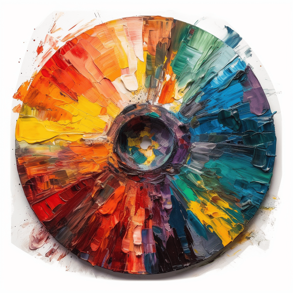
The color wheel is a fundamental tool in color theory. It organizes colors in a circle, showing the relationships between primary, secondary, and tertiary colors.
- Primary Colors: Red, blue, and yellow. These colors cannot be created by mixing other colors.
- Secondary Colors: Green, orange, and purple. These are created by mixing two primary colors.
- Tertiary Colors: These are created by mixing a primary color with a secondary color, such as red-orange or blue-green.
Color Harmony
Color harmony refers to the aesthetically pleasing arrangements of colors. Understanding color harmony helps in creating visually appealing and balanced artwork. Here are some common color harmonies:
- Complementary Colors: Colors that are opposite each other on the color wheel, such as red and green. These create a vibrant look when used together.
- Analogous Colors: Colors that are next to each other on the color wheel, like blue, blue-green, and green. These combinations are serene and comfortable.
- Triadic Colors: A set of three colors that are evenly spaced around the color wheel, such as red, yellow, and blue. This scheme offers a high contrast while maintaining harmony.

Applying Color Theory in Adult Coloring Books
Choosing the Right Colors
When working with adult coloring books, selecting the right colors can make a significant difference. Begin by identifying the mood or theme you want to convey. For a calming effect, choose analogous colors. For a more dynamic and energetic feel, use complementary colors.
Creating Depth and Dimension
To give your coloring pages depth and dimension, use shading and blending techniques. Start with a base color and then add darker shades for shadows and lighter tones for highlights. This technique will make your images look more realistic and three-dimensional.
Experimenting with Color Palettes
Don’t be afraid to experiment with different color palettes. Try combining unusual color combinations to see what effects they produce. You might discover a unique style that sets your work apart.
Advanced Color Theory Concepts
Warm and Cool Colors
Warm colors (reds, oranges, yellows) are associated with energy, warmth, and comfort. They tend to advance in an artwork, making them appear closer. Cool colors (blues, greens, purples) are calming and soothing. They tend to recede, creating a sense of distance. Use this knowledge to manipulate the perceived distance and importance of elements in your coloring book pages.
Color Temperature and Mood
The temperature of colors can influence the mood of your artwork. Warm colors can evoke feelings of warmth and excitement, while cool colors can bring a sense of calm and tranquility. Consider the emotional impact you want your artwork to have and choose your colors accordingly.

The Psychology of Color
Different colors can evoke different emotions and responses. Understanding the psychology of color can help you convey specific feelings through your artwork. For example:
- Red: Passion, excitement, and urgency.
- Blue: Trust, calmness, and professionalism.
- Yellow: Happiness, energy, and caution.
- Green: Growth, harmony, and freshness.
- Purple: Royalty, luxury, and wisdom.
Tips for Beginners
Start Simple
If you are new to color theory, start with simple projects. Use a limited color palette and gradually expand as you become more comfortable. Focus on mastering the basics before moving on to more complex techniques.
Practice Regularly
The key to improving your coloring skills is practice. Regularly working on your coloring books will help you develop a better understanding of how colors interact and how to use them effectively.
Use Quality Materials
Invest in good quality coloring materials. High-quality pencils, markers, and paper can make a significant difference in the final outcome of your artwork. They offer better pigmentation, blend more smoothly, and are more durable.
Seek Inspiration
Look for inspiration in various places. Art galleries, nature, and online resources can provide you with new ideas and techniques to try. Don’t hesitate to experiment and push your creative boundaries.
Conclusion
Mastering color theory is a journey that requires practice and experimentation. By understanding the color wheel, color harmonies, and the psychological impact of colors, you can create visually stunning and emotionally impactful designs. Remember to start simple, practice regularly, and use high-quality materials. With these tips and a deeper understanding of color theory, you will be well on your way to creating beautiful and harmonious coloring pages.

F.A.Q.’s
How to pick colors that go together?
To pick colors that go together use a color wheel to complimentary and analogous colors that pair well with each other. You can also use an online color scheme generator.
Is color theory real?
Color theory is a framework for understanding how colors interact and affect each other. It includes principles like the color wheel, harmony, and contrast. These principles are used in art, design, and marketing to create visually appealing and effective combinations. While based on human perception, color theory is a widely accepted and practical guide in visual disciplines.
